Session Volume Profile Indicator
Volatility & Volume Analysis Series
Session Volume Profile maps volume distribution across price levels within a session, exposing high-volume nodes (HVNs) and low-volume nodes (LVNs) — critical areas where price tends to consolidate or reverse.
Unlike standard price action tools, this indicator exposes the hidden order flow that institutional market makers use to manage large positions, giving retail traders a rare window into true market structure.
Mostly used on: TradingView, NinjaTrader
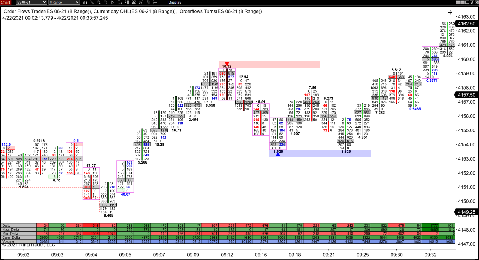
The Session Volume Profile renders a horizontal histogram alongside your chart showing exactly where trading activity is concentrated. High-volume nodes represent price levels with significant acceptance — prices tend to gravitate toward these zones. Low-volume nodes represent price voids that, once entered, often result in rapid price movement as there is little resistance in these areas.