Maximum Drawdown Threshold Indicator

Long-Term Entry Signal Series
Key takeaways

The Maximum Drawdown Threshold belongs to a group of risk indicators, meant to be analyzed on both daily and weekly timeframes.

It quantify uninterrupted price weakness across multiple timeframes, delivering a concise and layered view of market stress. This indicator is designed to identify periods of extreme undervaluation driven by panic, making it a powerful tool for spotting long-term entry opportunities.

Mostly used on: MQL5, QuantConnect
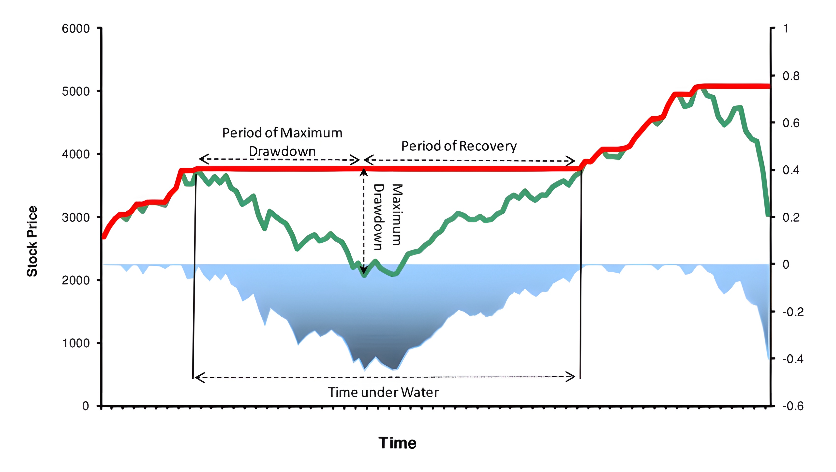
image


Traditional maximum drawdown is defined as the percentage loss from a local peak to its subsequent trough, calculated by ((Trough−Peak)/Peak)×100. While widely used in portfolio risk analytics, this method condenses complex price action into a single number, often missing the tempo and intensity of a selloff. For example, a decline in the S&P 500 from 3300 to 2400 is correctly captured as a -27% drawdown—but fails to express whether that drop was a slow bleed or a panicked capitulation, both of which carry vastly different implications for market sentiment.

The chart above illustrates the traditional maximum drawdown indicator, which appears smoothed due to its reliance on percentage-based calculations, masking the persistence and behavioral intensity of the decline.

image


Unlike the conventional MDD, the Maximum Drawdown Threshold Indicator shifts the focus from peak-to-trough amplitude to temporal persistence of downside movement. At its core, it calculates the number of consecutive trading days in which the closing price remains beneath all previous closes in a given lookback window. This persistence is computed across four rolling periods—14, 30, 52, and 208 days—and is then visualized as a stacked histogram. The result is a multi-resolutional readout of drawdown endurance, capable of exposing both shallow but relentless declines and abrupt collapse events. It captures the psychological depth of selloffs and the fragility of unchecked bullish trends that mask growing downside vulnerability.

The chart above displays the price action of VOO from 2016 to 2022. The dark red spikes in the Maximum Drawdown Threshold Indicator highlight periods of extended structural weakness—marking historically favorable long-term entry points.

image


Shorter periods (14/30) are intended for analysis on the daily timeframe. The 14-period histogram (dark blue) reflects maximum drawdown behavior over two weeks, while the 30-period histogram (light blue) captures drawdown over a one-month window.

Longer periods (52/208) are optimized for the weekly timeframe:. The 52-period histogram (light red) represents annual drawdown persistence, and the 208-period histogram (dark red) tracks structural weakness over a four-year cycle.

Short-term spikes in the 14/30 periods can signal tactical entry and exit points for swing trading, given that a broader trend is already established. These movements are useful for timing reversions or accelerations within an established directional bias. In contrast, sustained elevation in longer windows (52/208) often reflects deep, long-term undervaluation—ideal for entry.

Simultaneous spikes across multiple timeframes suggest systemic panic, while fading histogram bars indicate stabilization or early-stage recovery. A full reset to zero implies fresh price discovery and a potential break of the all-time high. The Maximum Drawdown Threshold excels in long-term asset analysis, where oversold conditions driven by panic often precede asymmetric upside reversals.